Search Drea's Blog

Thursday, December 13, 2012

Mapping the Station Fire, 2009

Los Angeles County Station Fire, 2009

On August 26, 2009, a fire broke out in the Angeles National Forest for several weeks. The Station Fire was the largest fire to ever occur in the Los Angeles County. Even on the state level, the Station Fire of 2009 is now “the tenth largest wildfire in modern California history” (Wonaschütz). In fact, in a matter of hours, the fire expanded from 45,000 acres to well over 100,000 acres (Marciano). The immensity of the Station Fire thus makes people ask many questions. One of these, which will be addressed with the help of the following maps, is the effect and extent of the fire on its neighboring communities.

This first map above is a reference map that shows the location of the Station Fire for those who are not familiar with the Angeles National Forest. It gives us a bigger picture of the fire’s relative location. First of all, the growth of the fire is depicted on top of a layer covering the area of the Los Angeles County. Doing this shows the large size of the fire since it clearly covers a relatively large amount of area. Furthermore, for those who do not know the location of the Los Angeles County and its size in relation to the other California counties, an inset is provided at the lower right-hand corner of the map. Examining the inset, one can begin to see or at least imagine the impact of the fire based on its size. Additionally, freeways are included within the Los Angeles County boundary in order to further show the fire’s location. However, the freeways will also be useful for the later maps in order to show some of the neighboring communities.


The second map above is another reference map that specifies the location of the Station Fire a little more. On a larger scale than the first map, this map shows the proximity of the fire to the surrounding major cities as well as the corresponding freeways that act as networks between cities. While this map shows us that the fire did not expand to many freeways or cities, we cannot really tell if there is an overlap between the fire and the populated areas. As a result, we need further analysis to determine that indeed thousands of evacuations were necessary during the duration of the Station Fire (Marciano). In fact, the Station Fire ranged from the Sunland-Tujunga are to the eastern Altadena area as well as the all the way up to Acton (The Associated Press).


As a result, the third map above shows the effect of the Station Fire on some of the most populated areas in the Los Angeles County. For this map, I found data of populated places as polygons instead of points because we can easily layer the spread of the fire over several areas. Using the effects toolbar, I was able to make the fire perimeter layer transparent enough to show the overlap. Clearly, some of the directly affected areas include La Crescenta, Glendale, and La Canada-Flintridge. However, some places were more severely affected than others. Furthermore, I included local hospital locations as points in order to show where the people affected could get help. This is especially crucial since well over 10,000 houses were forced to evacuate and still some were stubborn to leave their homes (Marciano). It is interesting to see that most of the hospitals are found very close to the freeways, which made them very accessible during the Station Fire. Such accessibility was necessary. For instance, at one point, officials had to rescue people trapped in their ranch because they did not follow mandatory evacuations (The Associated Press). Injuries occurred as a result of similar incidents.

 
The fourth map shows above gives us a bit more information about the neighboring communities affected by the Station Fire. In order to make this map, I used some ArcMap skills and used the LA County DEM to portray the slopes of local populated places. Making this map as a function of the slope shows that the slope played a big role in the spread of the fire. Perhaps the steep slopes of the regions that were most affected can help us explain the disaster. Indeed, flames remained “spotty in steep terrain” (The Associated Press). As a result the steep land made this fire very out of control (Garrison). At the same time, we can see some areas with steep slopes that were not as affected. Once again, on this map I increase the transparency of the fire’s perimeter to clearly see the most affected populated areas.


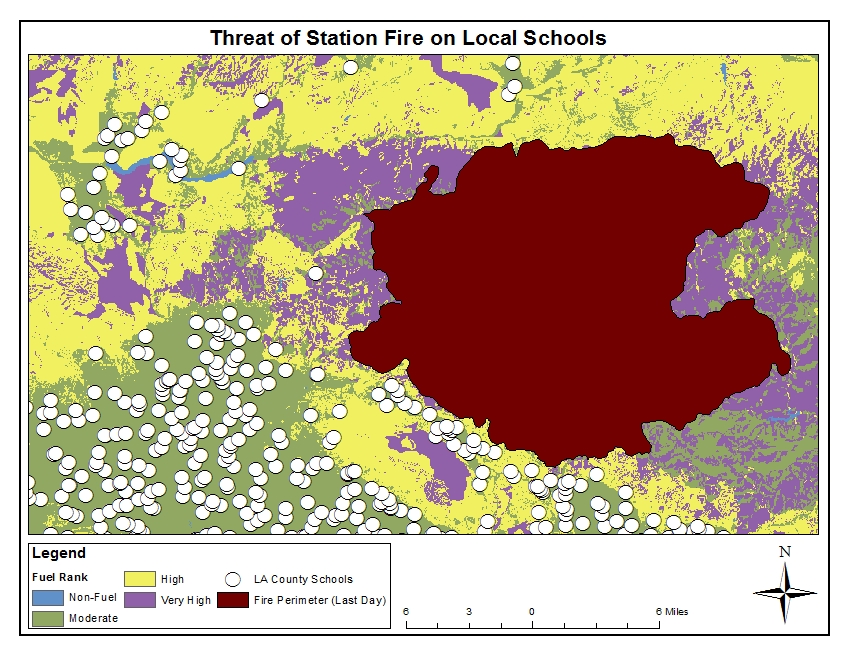
My final map provides schools as an example of a structure in the neighboring communities that were at risk through the duration of the fire. To do this, I used data on the fuel rank of the Los Angeles County. Specifically, the fuel rankings area assigned based on expected fire behavior for specific combinations of topography and vegetation under a severe weather condition. On my map, blue areas indicate hardly any fire threat, green areas indicate moderate threat, yellow areas indicate high threat, and purple areas indicate very high fire threat. The first thing that stood put when I initially put this map together was that for the most part, schools are build in zones with moderate fuel rankings. A relatively few number of schools are built on zones that can be highly dangerous in case of a fire. We can also see that fortunately no schools were burned down by the fire. However, it is clear that many schools must have remained closed until the fire was contained. In fact, all of the schools in the Glendale Unified School district were closed and had to push back the start of the school year due to poor air quality ("Station Fire Update"). In addition, La Canada Unified School District enforced the same rule to all of its schools (William-Ross). Schools in the Pasadena Unified District as well as the Los Angeles Unified district suspended their outdoor athletic activities (Barge).

Due to the severity of the fire, it is clear that many communities were at risk. In this report, I show that specifically the communities neighboring the fire were most at risk. In addition, some communities were hit harder than others as evidenced by the number of evacuations and number of homes lost. The final map shows the schools within the affected communities to further demonstrate the gravity of the situation. On another note, ArcGIS was a very useful tool for this assignment, for it made comparisons and relationships very easy to make.


Works Cited:


Barge, Evelyn. "Station Fire Resources and Blogroll for Up-to-minute Information." Rose Magazine. 29 Aug. 2009. Web. 08 Dec. 2012.

Garrison, Jessica. "Station Fire Claims 18 Homes and Two Firefighters." Los Angeles Times. Los Angeles Times, 31 Aug. 2009. Web. 08 Dec. 2012.

Marciano, Rob, et. Al. "'Angry Fire' Roars across 100,000 California Acres." CNN. Cable News Network, 31 Aug. 2009. Web. 08 Dec. 2012.

"Station Fire Update." City of Glendale California. 30 Aug. 2009. Web. 08 Dec. 2012.

The Associated Press. "53 Structures Burned in Station Fire." ABC 7 News. ABC, 31 Aug. 2009. Web. 08 Dec. 2012.

William-Ross, Lindsay. "Station Fire Update: Evacuations, School Closures & Other Info." LAist. 30 Aug. 2009. Web. 08 Dec. 2012.

Wonaschütz, A., et. Al. "Impact of a Large Wildfire on Water-soluble Organic Aerosol in a Major Urban Area: The 2009 Station Fire in Los Angeles County." Atmospheric Chemistry and Physics 11.16 (2011): 8257-270. Print.


Data Sources:

http://gis.ats.ucla.edu/mapshare/

http://frap.cdf.ca.gov/data/frapgisdata/download.asp?rec=frnk

http://egis3.lacounty.gov/eGIS/category/gis-data/fire/

Sunday, November 25, 2012

Mapping Census Year 2000

The point of this assignment was to use our skills in ArcGIS in order to map the US Census in the year 2000. When looking at data that was essentially collected by counting, there are many ways to organize it and reflect it. Looking at the first map above, we can see that this map shows the number of people in the year 2000 by counties in the US. In order to map this data and make this first map as well the following two maps, it was essential to join our census data to the counties data. Specifically to this map, it is clear that the darker purple areas represent the most populated counties while the lighter blue areas represent the least populated counties. Using a gradient color ramp in the legend is very visually effective because anyone can simply glance at the map and notice the counties or regions in the US where most people reside. For example, one can look at Alaska and Hawaii and notice that almost no county in Alaska contains more people than any county in Hawaii. Furthermore, the intervals used in the legend are also effective because it neatly categorizes the data and allows us to only use a few colors in the color ramp. That way, no two colors are alike and it is easier to make distinctions.
This next map above reflects the difference in number of people from the census 2000 and the previous census of 1990 by county. Joining our census data to the counties data was also necessary for this map and while this map looks a bit more complicated (mainly because of the title), the data is easy to explain. The difference in the number of people between 1990 and the year 2000 is simply calculated by subtracting the number of people in each county in the year 1990 from the number of people in the corresponding county in the year 2000. Population gain is exhibited if the difference is positive while a negative difference reflects a loss. Once again, the color ramp is very efficient in this map because it makes it easy to see which counties grew in population in that 10-year time period. Clearly, the dark green shows a larger population increase while the bright pink shows a larger population loss. While the color ramp looks a bit odd because it is not necessarily a gradient, it is still very useful because clearly the green shows population increase while the pink shows population loss. Hence, it is very easy to tell at first glance which counties and/or regions had greater population increase as well as which had greater population loss. Taking Hawaii and Alaska again, one can easily see that some counties in Alaska exhibit population loss and most of the counties  that did gain in population did not gain as much any county in Hawaii. Moreover, the intervals used in the legend are once again useful at effectively separating the data.
This third map above shows the percent change from 1990 to 2000 in the total population per county. This map is a bit different from the previous two because the data is in terms of percentages as opposed to whole numbers. The data in this map is also simple to explain. The percent change in the total population per county is calculated by subtracting the total population in each county in the year 2000 by the total population in the corresponding county in the year 1990 and then dividing the difference by the total population per county in the year 2000. Of course, we then multiple each result by 100 to get our percent change. One may initially think that this map is very similar looking from the previous map when printing in black and white. However, this map does not just reflect population gain and loss per county. This map shows us the relationship between the population gain or loss per county and the total population per county. In a way, it tells us which of the two pieces of data dominates the ratio. Once again the color ramp is very useful because it shows which counties exhibited a large percent increase in population as well as which counties exhibited a large percent decrease in population. Looking at Hawaii and Alaska once more, we notice that the counties that have a net loss in population in Alaska also have a percent decrease in population. Meanwhile, in Hawaii some counties that exhibited the same or similar population gain have entirely different population percent increases. The ratio interval used in the legend is useful in this case because it neatly categorizes the percent changes.
This final map shows the population density for every county in the US according to the 2000 census. This map did not only require us to join our census data to the counties data but also to use the field calculator in order to compute the different densities. However, the calculations, while automatically done when inputting the formula, are quite simple. The densities are calculated by dividing the total population per county in the year 2000 by the total area (in square miles) of the corresponding county. Therefore, this map shows us how heavily populated counties are with respect to their areas. The gradient color ramp used for the legend in this map is reminiscent of the legend for the first map we observed. Since there are no negative values, it is not necessary to have contrasting colors in the legend. Furthermore, the gradient color ramp is effective because it makes it easy to notice which counties have a large population compared to their areas and which counties have more "openness and space." Taking our example of Alaska and Hawaii one last time, we can see that Hawaii is mostly made up of counties that are dense while Alaska is mostly made up of counties that are less dense. A map of population density such as this one can be useful for emergencies because it tells us that the darker navy blue areas are more difficult to evacuate due to how heavily populated the area is.

Overall, it is interesting to see how data such as counting the number of people in the United States can be reflected in maps when joined with other useful information. While the four maps above tell us different things about population, not one is more useful than any other. In fact, one map may be more useful for emergency purposes while another may be more useful for studies. However, this map series as a whole is very interesting especially because the same data source was used for every map. I think that ArcGIS was very easy to use for this assignment.  The tutorial was quite easy to follow and there were minimal complications along the way. This time, I felt that every step I did made sense, but that could be because I am getting more used to ArcGIS. All in all, ArcGIS served as a very useful tool to neatly and effectively create all four maps.

Tuesday, November 13, 2012

Elevation Models


3D Model


The extent of the area we worked with is 39.8291666661 decimal degrees from the top, 39.3838888883 decimal degrees from the bottom, -105.788888889 decimal degrees from the left, and -104.969444445 decimal degrees from the right. The coordinate system used is the GCS North American 1983 and the datum is the North American Datum of 1983. The specific area selected is somewhere in middle of Colorado state. Specifically, the area spans from the Arapaho National Forest, to the city of Westminster, to the city of Castle Rock, and to the city Jefferson. Therefore, it covers all the cities and regional parks in between.

Sunday, November 11, 2012

ArcMap: Map Projections


Map Projections: The Good and the Bad

Working with ArcMap to explore different map projections made me understand the purpose and importance of map projections as well as the potential dangers. In this assignment, we used our basic knowledge of ArcMap to estimate the distance between Washington DC to Kabul using any six map projections (2 conformal, 2 equal area, and two equidistant). There are several stark differences between the projections I used. The most important one specific to this assignment is the different distances between Washington DC and Kabul depending on the projection used. It is clear that the distances vary from about 5069 miles using the Mercator projection to approximately 8763 miles using the Behrmann Equal Area Cylindrical projection. This discrepancy between projections is a big disadvantage when trying to measure the distance between two points. This can potentially be dangerous when planning travels or even secret missions between two places. 

Furthermore, another downside to map projections is that earth distortions are inevitable, meaning that there is not a single projection that retains all properties such as shape, area, direction, and distance. Hence, this can be very time-consuming when using projections being that different map projections must be used for different types of measurements needed.  This is especially important when looking at a small-scale map. The distortions can also be a negative because not everyone is familiar with all the different types of map projections. In fact, the Mercator projection is probably the one most people have seen while the Lambert Conformal Conic, the Two Point Equidistant, and the Equidistant Conic may look very foreign to many people.

Aside from the many downfalls, map projections are also very important. For instance, map projections are a necessary part of maps because the earth is a three-dimensional object that must be somehow displayed onto a two-dimensional surface. While distortions are always present, sometimes they are not important. For example, map projections are not important when looking at large scale maps. Furthermore, map projections have been categorized in such a way that it is convenient and easy to choose one in map making. When trying to preserve distance it is convenient to choose an equidistant projection. For preserving areas, it is smart to choose an equal area projection and for preserving angles locally, it is good to choose a conformal projection. Even within these useful categories, though, different projections provide more accuracy in other areas. For this particular assignment, it is probably more accurate to choose to use the equidistant projections because we are trying to measure the distance from Washington DC to Kabul. In fact, when looking at the Two Point Equidistant and Equidistant Conic, the discrepancy of the measured distance (6649 miles versus 6972 miles) is not as significant as when looking at the conformal projections or equal area projections.  

However there are even more advantages to map projections. As previously mentioned, without map projections, it is impossible to transform the three-dimensional earth into a two-dimensional map. Hence if we did not use projections, we would have to refer to a globe model to get measurements. However, there are many downsides to the globe that are in fact advantages of map projections. For instance, three-dimensional objects such as the globe are difficult to store and carry around. Also, even if we have a very large globe, it will always have a very small scale and hence it is difficult to see any detail. Furthermore, globes are very costly to make and difficult to update. These are all things that map projections make convenient to do. Specifically, map projections allow us to easily but carefully make maps that conveniently fit in pockets. Also, projections allow us to make very large scale maps that can show a small town with great detail. Lastly, maps are clearly cost-efficient and easy to update. 

 Referring back to ArcMap, it is a very useful tool to see the different types of projections. It was actually very easy to explore different projections and accurately portray the data. On another note, map projections themselves are a very powerful tool in society. They can easily manipulate people's minds. Using the example of the Mercator projection, Europe  and North America appear to be much larger than Africa. This projection, which is one that most of us grew up with, thus somehow gives more importance and power to Europe and North America to the rest of the world. This is an advantage of map projections as well as a peril. It is important to see that map projections can be used to make statements.